Websites: Where Do You Get One?

You need a website. But where do you even start? Do you try to do it yourself? Do you hire a professional? Which one? There are a lot of factors to consider when it comes to getting a website created. The good news is there are tons of options out there these days. The bad news is it can be overwhelming trying to figure out which one is best for you.

Here is a quick guide to set you on the right track.

Start by asking yourself 3 important questions:

What do I want my website to do?

We don’t just mean what a website does for visitors, but also how you as the business owner interact with the website on the back end. The answer will tell you a lot. For example, if you only want to provide static information to the public and don’t need visitors to perform any actions, your website build will look a lot different than if you need to incorporate interactive elements or more complex functionality.  The more complex your website, the higher the cost. Depending on your needs, you may be looking at anything from paid add-ons or plugins to complex APIs or custom-developed code.

What is my budget?

Sometimes, we allow ourselves to dream much bigger than our bank accounts. We imagine all the bells and whistles until we see the cost estimate, and then we get a lot less picky. A good rule of thumb when budgeting for your website build is to start with the absolute necessary functions. What can you not live without? That’s your starting point. Everything else is gravy.

How much am I willing or able to do myself?

All other things being equal, we all have two resources to spend: time and money. The question is, which one is preferable? If you have the time, knowledge, skills, and willingness, you can build a simple site yourself. It will be much cheaper than hiring a professional, but everything from coding to compliance and maintenance will be up to you. If you can’t do those things, or you need something that’s beyond your expertise, then you’ll want to hire a professional web builder.

I want to build a site myself. Which platform do I choose?

This is where you’ll have to do a bit of research and evaluation. There are a lot of options out there, and all of them come with a set of pros and cons. Only you can decide what works best for you. A few things to consider:

  • DIY template web builder services are easy to set up but will severely limit your options as far as design and functionality. They may be a good option for static websites or small e-Shops, because platforms specifically built for eCommerce (like Square) have a lot of the accounting and processing aspects already built in for you. Your website won’t be unique, but it will do what it’s supposed to.
  • Self-hosted websites carry an additional hosting cost but allow for more flexibility. This can be good or bad, depending on your skill level and experience. WordPress is an industry champion because it’s easy to use and adaptable. There are a lot of plugins and add-ons available, many of them free, but some come with serious security risks, or might stop getting updates in the future. This would be a good option for those who want more control over the design of their website or need to incorporate a blog or other regularly updated content. However, it requires at least basic knowledge of HTML and CSS.
  • AI is also an option (but not recommended). We include this here only because it exists. Nerd Crossing does not endorse using AI to build websites for a very practical reason: If you don’t understand how something is built, you can’t fix it if something goes wrong. AI can spit out a webpage based on a prompt. But the created page is not easily editable, requiring you to prompt again every time you want to make a minor change, and each additional prompt can complicate or break the code in unforeseen ways. The code may also come with security vulnerabilities that can put your website, your account, and your (or your visitors’) personal information at risk.

Sounds like I’m better off hiring a professional… How do I know which one is right for me?

This again comes down to research. You have a lot of options, and you need to evaluate what is most important to you. Do you care what platform your website is built on? Does it matter whether your web builder is in your area or overseas? Is cost a major factor? When choosing a vendor, always follow these common-sense steps:

  1. Look up multiple options to evaluate, including small businesses, individuals, and large corporations
  2. Check the services offered, and whether they include hosting and on-going support and maintenance
  3. Confirm whether they provide template sites or custom builds and narrow down the results based on which you prefer
  4. Look at samples of their work to see if they align with your needs
  5. If possible, get references and talk to them (this may be important in industries and spaces with very specific technical or regulatory requirements, such as Special Districts)
  6. Interview each vendor to see if they’re a good fit
  7. Get a formal proposal or price estimate from each candidate
  8. Do a side-by-side comparison

Generally speaking, you hire an individual for small projects with little-to-no support needed, and a large corporation when you need something standard and reliable but not custom. Small businesses lie somewhere in between. Because they aren’t held to corporate rules, they can offer a lot of flexibility and customization, and because they have a solid client base in a variety of industries, they have the knowledge and ability to work with you to customize your website to your needs and provide more in-depth, personalized support.

Individual (Fiverr or similar) Small Business Large Corporation
Simple text-only website X X May be cost-prohibitive to screen out lower ROI clients
Custom design X X Usually locked to a set of templates with little to no customization
Hosting May only provide assistance to set up self-hosting for yourself X No self-hosting option
Special functionality May be cost-prohibitive X May be limited
Unique industry regulations May not have necessary expertise X X
On-going support May be unreliable or only on a project-basis upon request X May be limited, automated, or slow to respond
PRICE RANGE Low Medium High

I have a website but it sucks. What do I do?

Well, that depends. In some cases, the solution is simply to correct the most pressing issues and move on to more important things. This is usually a workable plan for simple, information-based websites.

In other cases, because of ADA compliance issues or other problems, it’s easier to start from scratch and build a new website from the ground up. For larger businesses that rely on their websites more heavily, a “bad” website can create cybersecurity vulnerabilities so starting over is usually the safer solution.


You sound like you know what you’re doing. Can you build me a new website?

You bet we can! Nerd Crossing has been in the business of building websites for over 15 years. Our clients include small businesses, medical practices, special districts, government organizations, non-profits, and more. We offer custom-designed websites tailored to your brand and budget. If you’d like to chat more, give us a shout to schedule a free consultation.
Your ADA Compliance Checklist

Whether you’re running a business, providing information for your community as a non-profit, or offering services and resources as a government organization, your website has to meet basic ADA compliance standards.

The Americans with Disabilities Act (ADA) sets rules to ensure that your website is accessible to people with impaired vision. Because the government considers commercial websites “places of public accommodation,” an inaccessible site excludes users with disabilities in the same way an inaccessible physical storefront would. Failing to meet ADA compliance requirements may lead to lawsuits and penalties.

Here is a short list of the most common ADA compliance issues your website may have:


Headings

When creating or updating your website, you might be tempted to add headings to your pages because of the style. However, headings must follow strict rules of sequence and nesting.

Your page title is always H1, and it should be the only line of text with that heading tag.

The next heading below that must always be H2. If that section of text has smaller sections with subheadings, those must always be H3. The numbers get larger as you add sections within sections within sections. Then, the heading of the next big section is once again H2.

This is to ensure that when someone uses a screen reader, they can easily follow the page hierarchy and access the information in the order it was intended.


Fonts and Colors

Style is great. Adding color and fancy fonts to your website can definitely make a statement. But your text still needs to be readable by everyone, including people with impaired vision and colorblindness.

Your text must meet two requirements for ADA compliance: size and contrast. While size is self-explanatory, contrast can get tricky, especially when you’re using colorful backgrounds. For solid color backgrounds, use Adobe’s Color Contrast Checker tool to make sure your text remains compliant. If you’re using a photo or graphic as your background, it should be low contrast. For extra readability, try adding a white or black overlay (depending on the color of your foreground text).


Image Alt Text

Alt or Alternative Text is a brief description of the image that is entered into the metadata for the image. Screen readers do not have the ability to read images, so the Alt Text provides a clue as to what the visitor should be seeing.

Alt text is required on all images, except in cases where the image is purely decorative, such as an abstract background, or a staff member headshot whose name is included with their photo.


Graphics with Embedded Text

Sometimes you make a graphic or a flyer and it looks so good you want to display it on your site. Putting it up as a picture saves you a lot of time retyping and styling the content, so why not, right?

Wrong. As mentioned above, screen readers cannot “read” the information embedded in an image. For ADA compliance, large sections of text and important information must be typed on the webpage in order to be accessible and readable. If you want to showcase your flyer, include it as a thumbnail for decoration.


Scanned PDF Documents

When sharing PDF documents through your website, ADA rules still apply. Your PDF must be readable using a screen reader. Scanned documents do not meet these requirements, unless you use an OCR scanner. Regular office scanners convert the printed page into an image.

In order to make a PDF document ADA-compliant, save the original source document as a PDF directly. If you have multiple documents that need to be merged, use a tool like Adobe Acrobat Pro to do so.

Warning: AI chatbots can sometimes extract text from images, but they are not always reliable and should not be used to make PDF documents ADA-compliant. This is especially true for government organizations, non-profits, and businesses that face higher public scrutiny.


When is it time to call in the pros?

Proactive compliance is always better than the alternative. Your website should start with accessibility and mobile responsiveness as the primary requirements. If it didn’t, or if it’s been a while since your website was updated, it may be time to reassess and reevaluate.

Call the Nerds to schedule a free consultation. We can perform an ADA assessment, and let you know what needs fixing, what could use some work, and how your website can be improved.

User Journeys: How Visitors Engage (or NOT) with Your Website

People don’t land on websites by accident. They get there because they are searching for something specific. In that sense, it’s more of a guided journey. Hence the term “user journey.” A User Journey maps out how a visitor moves through your website to find what they’re looking for, whether it’s a piece of content, a sign-up form, or a Donate button.

Ideally, your visitors can find their destination and accomplish their goal in 2-3 clicks or under 2 minutes. Any more than that, and they may get lost, frustrated, or give up completely.  So, you may say to yourself, “Why not just put everything on the home page, then?” That may be doable if you only have 2 or 3 potential user journeys, but for more complicated systems where different types of users need to find different information or perform different actions, you need a lot more planning and proper design.

Ask the important questions

  1. Who are my users?
  2. What are their goals when visiting my website?
  3. What are my goals for visitors coming to my website?
  4. What do visitors see when they first get to my website?
  5. Will they trust what they see?
  6. How will they know where to go and what to do?

A lot of times, these are not easy to answer. There may not be a right answer, or there may be multiple competing priorities that you want to juggle at the same time. This is why there is a whole professional field of Web Design (which falls under the larger umbrella of  User Experience Design) that trains people on how to create websites that don’t just look pretty but also accomplish a business goal.

Breaking it down

The Beginning
Generally speaking, your website has about 3-5 seconds to make the right impression on a visitor before they make a decision about whether or not to stay longer. In those handful of seconds, you have to prove your legitimacy, expertise, and accessibility all in one glance. If your website looks unprofessional, messy, or overwhelming, your visitors might choose to go elsewhere. First impressions can make or break a user journey.

The Middle
Naturally, you want to be able to communicate your expertise and years of experience. You want to showcase your past projects, glowing client reviews, and a gallery of awards. All of that is important. But most of it is a side quest to what your visitors really need. In order to understand what’s most important to your audience, you need to put yourself in their shoes. Better yet, ask a friend or family member. An outside perspective might reveal certain roadblocks or unnecessary detours you didn’t notice that may be costing you valuable business.

The End
The user journey ends when your visitors accomplish what they came to your website to do (find information, submit a contact form, etc.). Their experience along the way may become a deciding factor in what they do when they finally reach the end. It will also set their expectations for you and your business, and their decision on whether or not they choose to engage with you, or recommend you to others.

A Note on AI Search and Summary

As we’ve discussed in our previous post, AI tools don’t create something out of nothing. In order for AI searches and summaries to inform users about your business, your business has to exist online, which means having and actively maintaining a website. It’s all about content and reputation:

Content that is informative, reliable, and relevant to your business and industry will carry a lot of weight. The days of metadata tags are over. Now, search engines and AI tools scan the actual words on your website, so make sure you’re using the right ones.

Reputation extends beyond your website to everywhere on the web, and the more connections you have the better. From social media to Yelp or Google reviews and business listings in your local chamber of commerce directory, every little bit helps. 

So what’s the best measure of a website’s success?

Better question: What’s the best measure of your website’s success? Is it how long a visitor sticks around, or how many leads you get per month? Are you reaching those markers on a regular basis with your current website?

In business, the highest form of compliment and the best measure of credibility is repeat customers and organic referrals. At Nerd Crossing, we can proudly say that over 70% of our business comes directly from client referrals. We have worked with a broad range of businesses, non-profits, and government organizations for over 15 years, and we continue to serve our clients with the same dedication, professionalism, and care today.

If you need another pair of eyes on your website, give us a shout. We can schedule a free consultation and let you know what your user journeys look like, as well as recommend improvements to smooth out the wrinkles.

When Web Builders Update: Getting Nerdy With It

Technology is advancing and evolving every day. With the advent of AI, we’re seeing new tools emerge faster than ever. That also includes web builder platforms.  Sometimes, you build out your site with fancy add-ons, and then the builder updates, and you just hope your add-ons are still supported.

For example, the WordPress plugin Elementor, which we use for our Nerd Crossing website and some of our clients’ websites just launched version 4.0. Being the Nerds that we are, we checked it out. If your website isn’t currently hosted on WordPress, this post isn’t for you. If you are hosted on WordPress, and/or are interested in Elementor, keep reading!

Here’s what you need to know:

What’s New

Disclaimer: Elementor is a robust and versatile web builder and page builder that essentially allows you to create a fully custom website from scratch. While it has a lot of amazing functionality, it also has a learning curve and may not be right for everyone. With that said, Nerds love being nerdy, and this baby is right up our alley!

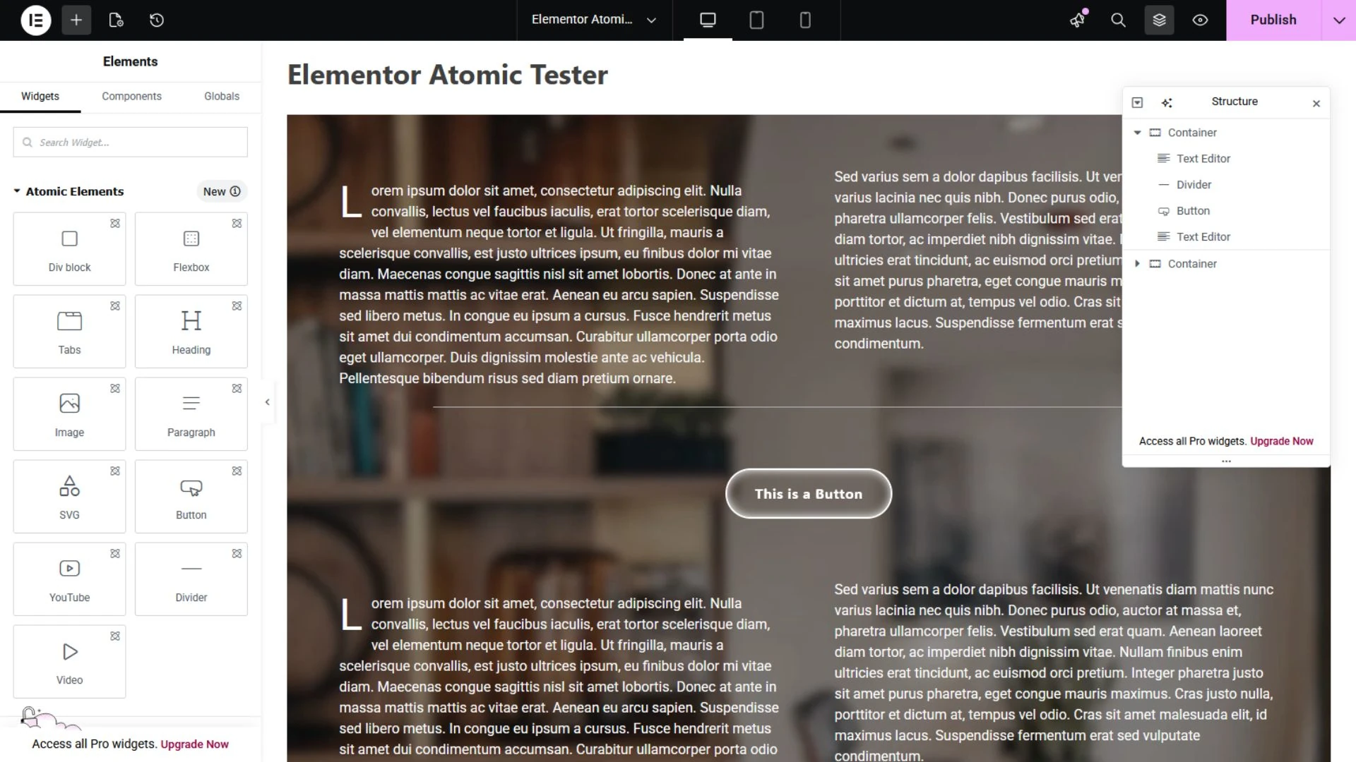
4.0, AKA “Atomic” is currently an optional version you can activate or deactivate in your Dashboard. The builder UI is still pretty much the same, but there are some new widgets and a new way to create styles, variables, and classes right in the page builder. This is a great feature which can streamline and simplify the styling of your entire website (as long as you know what you’re doing).

Pros

The new Atomic widgets are essentially blank building blocks which you can customize as much or as little as you like. How you customize them has also been streamlined, with settings grouped together in a more logical way that is uniform for each widget. No more clicking around to different tabs.

You can also now save elements as reusable components and make parts of them editable, which essentially means you can make your own custom widgets right there in the page editor. This is currently only available on the Pro version of Elementor, but creates a lot of potential flexibility for web designers.

Probably the best and most important part of this update is that it remains backwards compatible with older widgets and add-on plugins. Whatever you already built out on your website will still be functional and editable in this new version the same way as before. You can keep the widgets you already have on your site and continue to add them to pages going forward. 

Cons

As with all new technology releases, Elementor 4.0 has a few bugs that need to be worked out and some limitations we’re hoping will be addressed with future updates. There are only a few Atomic widgets currently available (with more to come). This may be offset for most users with the ability to create custom components, but you cannot create those with legacy widgets.

As this is a new update, some older add-on plugins that allow you to use Elementor templates, or combine or nest widgets don’t always recognize the new Atomic styling convention, which may cause issues. Until the plugins update for compatibility, you can avoid problems by substituting legacy widgets for Atomic ones.

The biggest limitation is the new Atomic Paragraph widget. Arguably the most essential piece of a webpage, it adds text one Atomic paragraph widget at a time. The Nerds rate it a 3/10. Less, if you’re working with large blocks of text, like a blog post. For this, we recommend using the legacy Text Editor widget, which still retains full functionality with more options for customizing your text in one instance.

While the Elementor web builder update made global styling easier in some ways, its most powerful functions may still be too complex for the average user, especially if you’re new to Elementor, or web design in general. Some knowledge of CSS is definitely required and recommended, even with more and more tutorials popping up on YouTube every day.

Conclusion

The new Elementor plugin does make creating style sheets easier as a user interface with variable controls that allows you to click through and preview changes to styling in real time, rather than typing out whole sequences of code and hoping you don’t miss an end bracket.  With that said, you are, in fact, creating modular code to style your website using this tool.

So who’s this for? Well, we probably wouldn’t recommend it as a starting point for beginners building their first website, but if you have a little experience under your belt and you like to kick the tires on new tech, this is a good one to try out. Also, if you’re handing off  a custom website to a client for future content edits, they might appreciate the WYSIWYG Elementor editor over the native WordPress Block editor, too. 

Need Some Help?

All of these new bells and whistles can be a lot to learn and absorb. But don’t worry, your friendly neighborhood Nerds are here to help you out! Does your website need an update, or an ADA compliance check? We can help! Give us a shout and we’ll get you sorted out.

Level Up Your Website with Multimedia Content (with Caveats)

Landing on a website full of text is the digital equivalent of reading a textbook for fun. If you want to engage your visitors to click around and absorb what you’re offering, give them something worth looking at.

Multimedia Content Boosts Engagement

A picture speaks a thousand words, they say. In today’s world of 3-second attention spans, the “elevator pitch” may be best delivered with a crisp photo. Multimedia content isn’t just about making your website pretty. These types of visual elements can communicate your message in a split second, long before a visitor reads a single sentence. Not only that, the richer experience will keep them on your site longer, which also increases the odds of them eventually reaching out. That’s incredibly powerful.

Infographics are another great tool to get your message across. Whether it’s illustrating a tricky process, or the impact you have on your local community, visitors will understand a clean visual faster and remember it longer. Visual content is also the backbone of social media. When your website content is rich with shareable visuals, your reach extends well beyond your homepage.


Now, The Caveat

Okay, so you’re sold on adding visuals. Great! But take a second to think about where your visuals will come from and how you will use them. This is where a lot of well-meaning business owners accidentally get into trouble: copyright infringement and privacy violations.

Copyright law applies to everything you find online. Every photo, video, illustration, and piece of music belongs to someone. Using it without permission can result in takedown notices, legal disputes, and massive fees, and “I found it on Google” is not a legal defense.

Likewise, using photos and videos of real people, including clients, friends, family, community members, or even event attendees without their permission is a violation of their privacy, and may pose a safety risk, especially when it involves minors. It also should go without saying that you should never upload anyone’s photo or video into generative AI.


How to Use Multimedia Safely

Use content you own
The safest thing to do is use photos you took yourself, or paid a professional to take for you. In both of these cases, you are the proper legal owner of the content. However, if those photos include other people, always make sure you get permission from them. A simple written release or permission form goes a long way.

Obtain properly licensed stock images and videos
Buy and download properly licensed content from reputable platforms. Search for royalty-free resources, which provide you with multimedia for free, or a nominal one-time fee that does not require you to pay usage royalties over time. Pexels, Adobe Stock, and Deposit Photos are all excellent places to start. Just make sure to always double-check the license terms before you purchase and publish.

A Special Note on AI

AI-generated content is a hotly debated topic currently being litigated on several fronts. While it is not illegal to use for now, it also cannot be copyrighted, meaning you can never own any multimedia you create with AI engines, or prevent others from using it however they choose. Just as importantly, public sentiment has been decidedly negative toward AI-generated content. Whenever possible, we recommend avoiding the use of this type of media for your website and marketing.


Level-Up Your Website

Multimedia content is one of the best investments you can make in your website experience. It grabs attention, tells your story, and keeps visitors engaged. If you want to spruce up your existing website, or build one from scratch to present your organization to the world at large, we’re here for you. Give us a call, or drop us a line, and let’s chat about how we can help your website make a real statement online.