


NERD WORDPRESS TIP:
If your website uses Atomic elements, you should always exercise caution when making changes to the style. If you are unsure of what to do, or need assistance, please contact Nerd Crossing.
NERD WordPress TIP:
Always remember that your website has Undo functionality and a revision history. If, for whatever reason, you need to go back to a previous version of your page or site, Nerd Crossing can help you do so.
Local Style vs. Class Style
Atomic styling is modular, and it gives users access to global style settings right there in the page editor. You may see multiple classes applied to one element. Depending on what you change, it may affect your entire website.
LOCAL styling will always apply only to the selected element. This allows you to make one paragraph or image look different from everything else on the website. Local styles will always override anything that was preset in the Class settings.
CLASS styling is everything that comes after Local in the class box. These are styles that were preset for you by Nerd Crossing, and apply to several types of elements on your website. By changing these, you will alter the look of all elements that use this particular class.
Color-coding
Every variable you change will be marked with a dot next to it, which will also be color-coded to indicate what you’re changing. Colored dots indicate that the change is being made on the selected class. Gray dots indicate that the default values were changed by another class which is not currently selected.
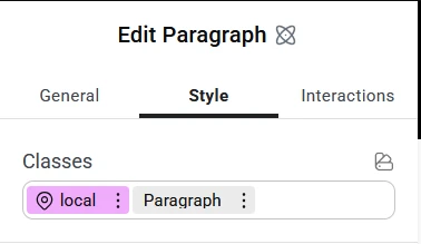
In this case, local is highlighted in violet and Paragraph is gray. This means that the styling will be applied only to the selected element.

Here, Paragraph is highlighted in teal. This indicates that you have selected a global class, and all changes made here will affect all elements on your website which have this class applied.
Style Variables
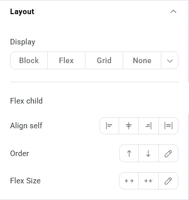
The Layout section allows you to control how the element displays (or not) on the page. To hide an element temporarily without deleting it, select None under Display at the top.
Align may have additional options, depending on what type of element you have selected. Flexboxes allow you to align elements inside them both horizontally and vertically.
Flex Size can sometimes override Align settings. Ex: Grow will stretch the element to the full width available, which makes the align option obsolete. To align left or right, select Shrink.
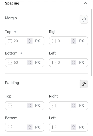
Spacing controls the space inside and outside the element. Margins are the space between the selected element and the surrounding ones. Padding is the space between the contents of the selected element and its edge.
Both of these options come with more granular control using the chain link icon. When the link is broken (Margin in the example screenshot), each side can be controlled individually. When it’s whole (Padding in the example screenshot), all four sides will be equal.
Hint: The gray dot next to the Top Margin indicates that a value was set for it by a class other than the one that was selected.
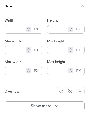
Size controls the size of the element. Unless you want to lock the element to a specific size, this section should be maintained on default settings to preserve proper mobile responsiveness.
If your website has elements with specific sizing, please do not change them, as this may negatively affect the look and feel of your website.
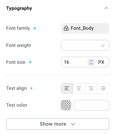
Typography changes the font options for the selected element. In this example, the Font Family is set to a globally-set variable. This means that when Font_Body is updated, it will change the font within this element as well. If you change it to something else, that connection will break and the font for this element will need to be updated manually going forward.
The Font family, Font size and Text alignment are set for the selected class (indicated by the teal dot). Any changes in this view will change all elements using this particular class.
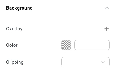
Background options can be layered. Color is the base option that will appear underneath anything else. You can use the + icon next to Overlay to add a different layer, such as an image or gradient. These will then have more options available for further styling.
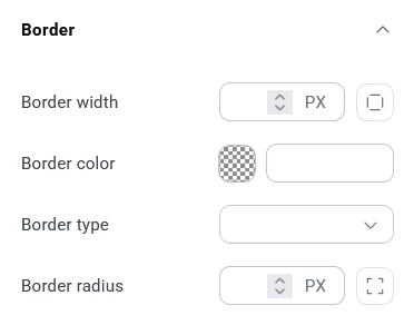
Border controls the frame around your element. It applies to the container box, not the content, so it will always have 4 sides.
Width can be equal around all sides or different for each side. Ex: you can have a thick border at the top and bottom, and no borders left and right.
Color will be applied uniformly to the entire border.
Type controls the style of line that will frame your element.
Radius refers to the corners. The higher the value, the bigger the curve.