Containers and grids allow you to create flexible subsections on your WordPress website to better organize and present your content. Both of these widgets are mobile-responsive which makes it incredibly easy to keep your webpages looking amazing, regardless of the screen size!
NERD ALERT:
This tutorial is based on a newer version of Elementor. If your website is using an older version, you may see an Inner Section widget instead of Containers and Grids. This widget works similarly to a container and can be used instead. Check out the Columns tutorial for this widget here.
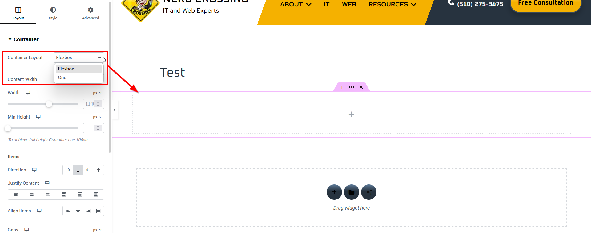
Containers vs. Grids

When you’re setting up your webpage, you’ll notice you now have two options for adding new sections.
Flexbox creates columns and rows with fluid widths. This means that you can create a section with multiple columns, and each column can be a different width, and each one can be changed individually.
Grid, as the name implies, creates a rigid structure that sets equal column widths automatically, based on the width of the page or container.
You will notice in the widgets section in the sidebar, you have similar options for Container and Grid as well. These work the same way. Think of a Container as a way to Group elements.
Don’t worry if you can’t decide which type of layout you need! You can always change the layout once it’s on your page using the ‘Container Layout’ dropdown.

Containers and grids can also be nested. In this example, I created a Flexbox main section, and drag-and-dropped a Grid widget into it. This separated my section into 6 equal-sized rectangles.
I then drag-and-dropped a Container section into the first rectangle on the grid. This will now allow me to add elements into the container to create a group. The group can then be duplicated, and each new copy will appear in the next rectangle on the grid to maintain the uniform structure.
NERD TIP:
Don’t know which type of layout to use? just consider the type of information you want to share. If you need to maintain a uniform layout of rows and columns, use a Grid. If you want more flexibility in how the content is laid out, or you want to group elements to create unique cards or sections, use Containers.
Working with Grids
Think of Grids as tables that preserve the sizing and spacing of individual cells. Grids keep your layout neat and even, regardless of what type of content you put in. But it will only allow one element per cell. If you try to add a second, it will automatically drop into the next cell in the grid.
Just because Grids are rigid doesn’t mean they can’t be customized. Use these control options to fine tune the look and feel of your page. Don’t forget to adjust the Tablet and Mobile layouts! You can switch between them by clicking the little icon next to the setting you’re working on.
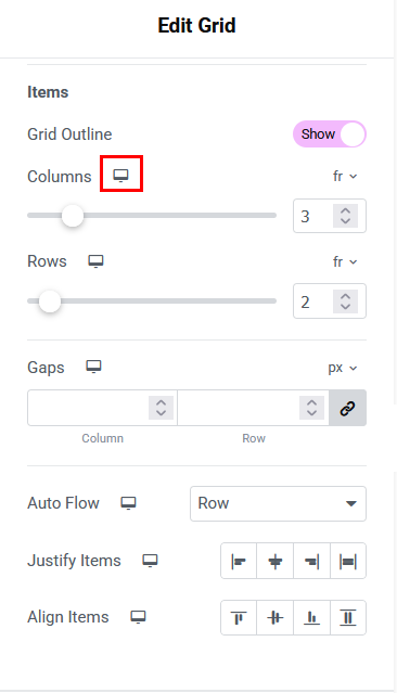
- Columns in a grid will default to 3 when you first add it to your section, but can be adjusted up and down as needed. The column width will be even and adjust automatically with the size of your screen or container
- Rows will default to 2. You can adjust this up or down. If you have less content than there are rows, the grid will preserve the extra rows as placeholders and you will see a blank space.
- If you think of a Grid as a table, then Gaps controls how much space is between the individual cells. You can control column and row gaps individually, or keep them linked to maintain even spacing throughout.
- Auto Flow tells WordPress how to organize your cells: left-to-right by rows, or top-to-bottom by columns. This will affect how your content is reordered on smaller screens or when the number of columns changes.
- Justify Items sets the horizontal alignment in columns: left, center, right, or full-width justified.
- Align Items sets the vertical placement in rows: at the top, centered, toward the bottom, or spread out along the height of the row.
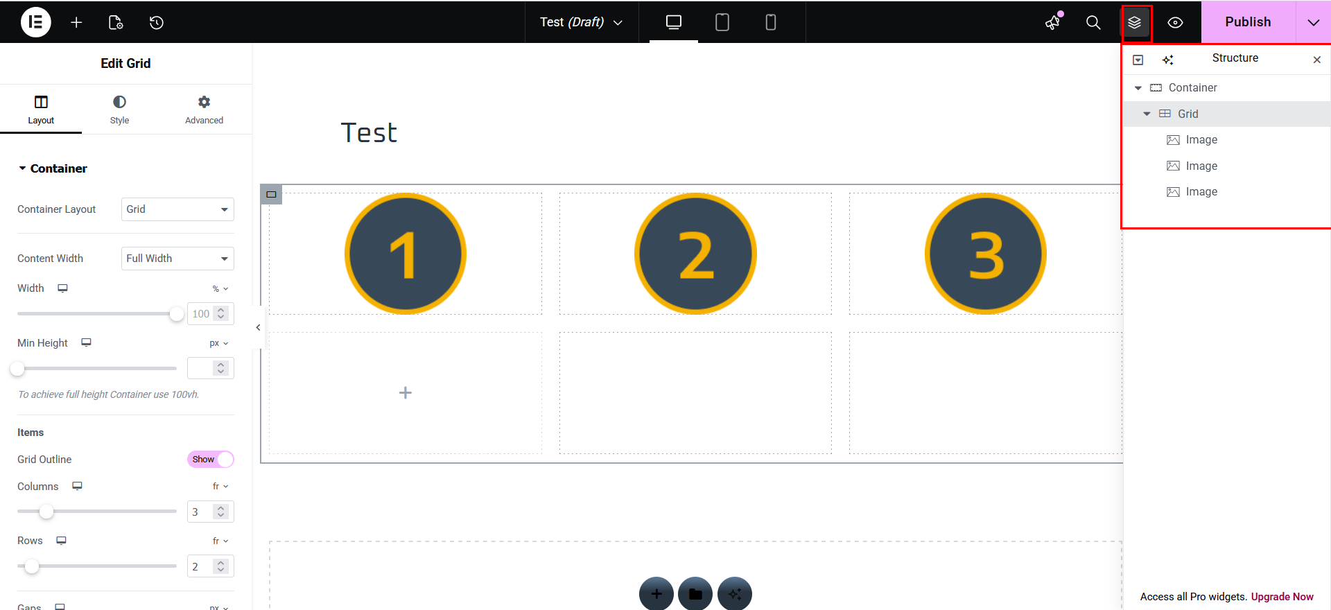

I have now added 3 images into my grid. If you click the Structure icon in the top bar, you will see how the page is laid out.
In the top screenshot, the Grid still has all the default settings.
In the bottom screenshot, I changed the Auto Flow setting to Column instead of Row to demonstrate the difference. We still have the same number of rows and columns, we still have the same structure of elements in the grid, but how the elements are ordered has changed.
Working with Containers
Containers are similar to Groups in the WordPress Block editor. You can add as many elements into a container as you like, including other containers and grids. You can even add a container to a container inside another container. This is referred to as nesting. The great thing about it is that you can apply styling to a container, and then duplicate it to easily create custom “widgets”.
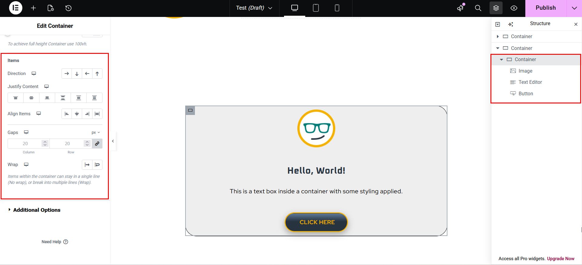

I have created a new section and added a container with some elements and styling. Like Grids, Containers also have layout controls:
- Direction dictates how elements are displayed in a container (Row-horizontal; Column-vertical; Row-reversed; Column-reversed). By default, this will be set to Column-vertical, with elements stacked one on top of the other (first screenshot). If I change it to Row-horizontal, it places the elements all in a row (second screenshot).
- Justify Content and Alignment both handle how the elements are aligned to one another. One will be horizontal alignment and one vertical alignment, and the definition of which is which will change based on the Direction you selected.
- Gaps is the same as in Grids, and controls the spacing between elements
- Wrap is unique to Containers, and controls how content is managed when you run out of space.
NERD ALERT:
Notice in the Structure tree that the Flexbox section and the Container widget are both just called “Container.” That is because they work the same way. To avoid confusion when organizing content on your page, you can assign unique names to Containers by double-clicking on the word in the tree.
Nesting Grids and Containers
The great thing about Containers and grids is that you can nest them however you like to achieve your desired look and feel. Let’s see how that works in practice!
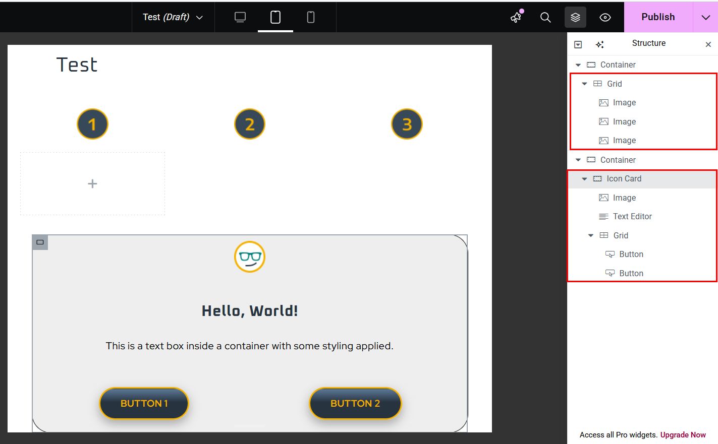
I now created two sections. In one, I still have a grid with my 3 images. In the other, I have a container. I have added a new Grid into the container to add a second button, and renamed the container as “Icon Card.”
You can see the layout and components in the Structure tree. The “parent” element will always have an arrow next to it, indicating it has other things within it. The “child” elements will always be shifter slightly to the right to indicate that they belong to the parent element.
Fun Fact: A child element of a child element is called a “grandchild”.
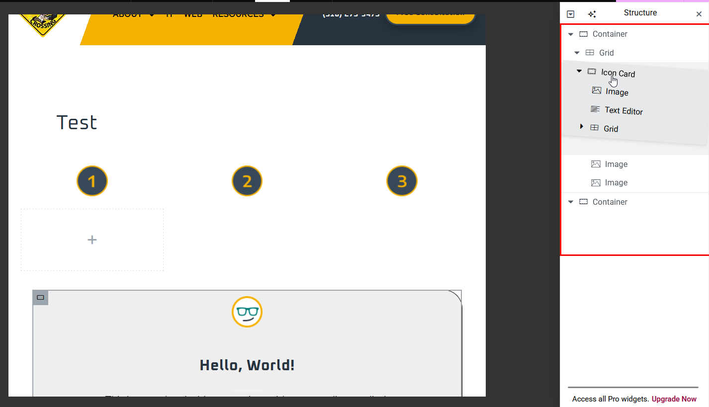
You can drag elements or even containers within the Structure tree to reorganize them. In this case, I’m going to put the Icon Card container into my grid.

Now our entire Icon Card container is inside our grid. This means we have a grid (buttons) inside a container (Icon Card) inside a larger grid.
Notice how much empty space has been added under the number images on either side of the card? That’s because the grid sets the row height based on the tallest element in the grid, and we chose to vertically align them at the top.
Also, notice how our two buttons are now overlapping? Let’s fix that…

- In the Structure tree, I clicked on the Grid that contains my buttons to select it.
- I then changed the number of Colums to 1
That’s it! 2 clicks, and my card is once again perfectly aligned because the Grid controls maintain equal height and width and spacing. Pretty cool, huh?
NERD NOTE:
Notice how the Rows in the image above still say 1, but you can clearly see 2? That’s because Grids automatically adjust these settings based on the amount of content you add. You can keep drag-and-dropping new elements in and it will keep adjusting to accommodate them!

Now, let’s say I want to have a section that has a number of these Icon Cards to display different options. I can do that easily by right-clicking on the Icon Card and clicking Duplicate.
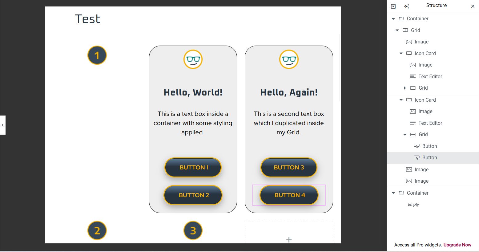
My duplicated card automatically dropped into the next cell over from the original. I now have two identical Icon Cards inside my grid, which have the same styling, but I can edit the content as needed. In addition, my image elements have shifted to the next row down, continuing the grid as its contents grow.
I can click-and-drag these containers and elements to reorder my grid as needed while preserving the spacing and formatting.