ADA Compliance: Colors and contrast
Colorful web pages may look pretty but for those with visual impairments or even just minor color-blindness they can be difficult to read.
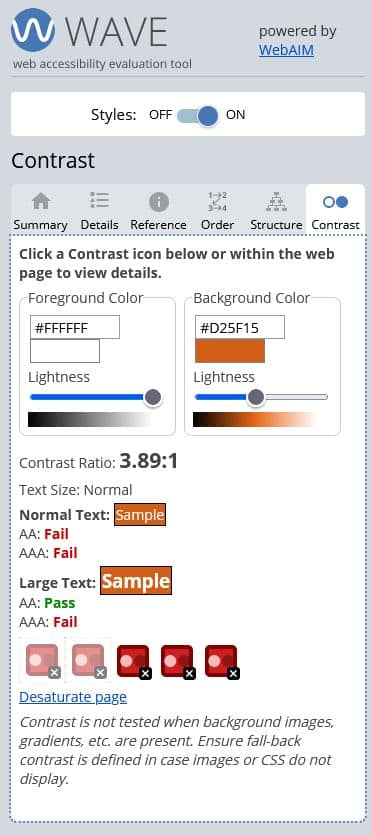
Text is required to have a sufficient contrast against its background to make it easy to read. The contrast ratio required is defined in the Web Content Accessibility Guidelines and will depend on the size of the font you are using and the accessibility level (AA or AAA) that you are trying to achieve.
We’ve mentioned the WAVE tool before (available as an online checker or as a browser extension) and this also measures contrast on any page you check. The screenshot shows where it has found a contrast ratio that has failed and it has a handy feature where you can test colors to see if they will pass.
Avoid colors in instructions
Since not everyone can determine colors we have to avoid instructions like “click the blue button” and use a better descriptive identifier – and of course the button itself should be clearly marked to identify its purpose as a standalone item.